1. Home/
  2. Tattoo Ideas/
  3. Brand Of Sacrifice/
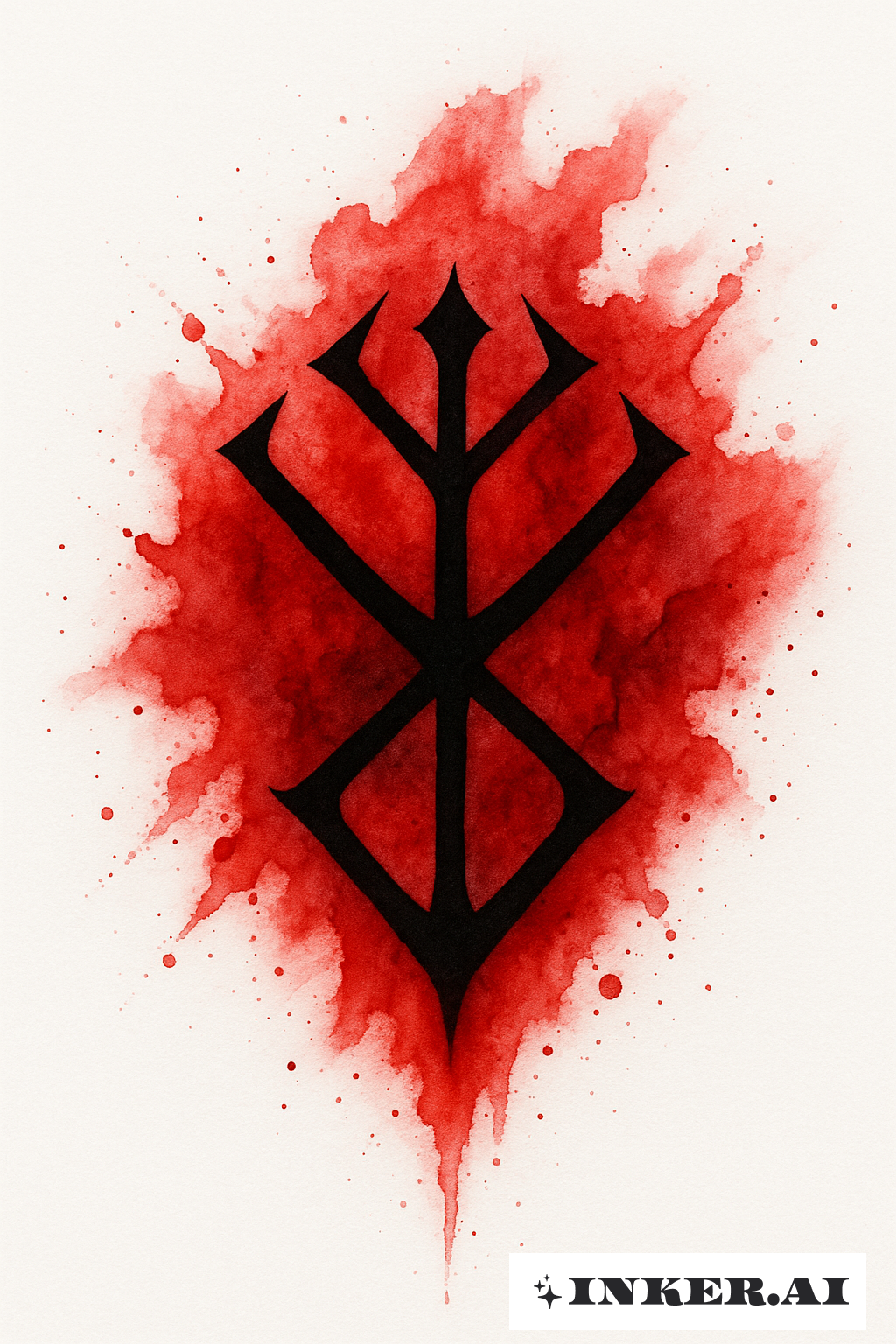
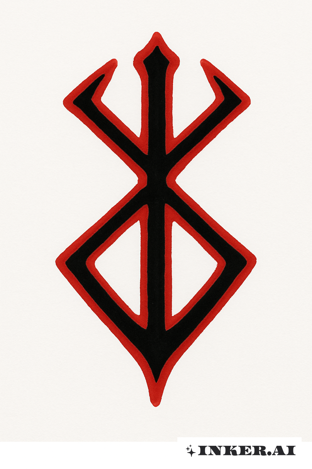
  4. A Bold Red And Black Brand Of Sacrifice

A Bold Red And Black Brand Of Sacrifice Tattoo

Bold red and black branded sigil with jagged edges and heavy black shading
Style: Basic
Download PDF Download PNG Copy URL

This piece centers on a stark, branded sigil rendered in saturated red and dense black ink. Thick, deliberate strokes form jagged edges and a flame-like core while negative space and fine stippling add depth and a scorched, textured look. Rendered in a Basic tattoo style, the graphic favors high contrast over delicate detail, making it ideal for medium-to-large placements like the forearm, chest, or shoulder blade. The red is used as both fill and accent—splashed within the central mark and feathered outward—while the black provides bold outlines and shadowed areas that give the emblem a stamped, three-dimensional appearance. As Brand Of Sacrifice tattoo ideas, this design works well as a standalone emblem or paired with subtle script, ash-like splatter, or minimalist geometric framing to emphasize the sense of ownership and ritual. Overall the layout balances raw energy with clean composition, ensuring the mark reads clearly from a distance yet reveals texture and layering up close.

Cultural Meaning Of A Bold Red And Black Brand Of Sacrifice Tattoo Design

The imagery evokes themes of marking, commitment, and transformation: a visible sign that something has been given up, vowed, or claimed. Red traditionally signals blood, life, and pain, while black conveys permanence, mourning, or protection—the two together suggest a rite that is both violent and sacred. In many cultural contexts a brand can represent belonging, initiation, or the acceptance of consequence; the jagged, scorched edges in this design underline the idea of a trial by fire. In a Basic tattoo style presentation, symbolism is distilled to its essentials so the viewer encounters the concept directly without ornate distraction. The emblem reads as an unapologetic statement of identity and sacrifice, and the overall composition can be interpreted as both a warning and a talisman depending on placement and the wearer’s personal story.

Design Inspiration Of A Bold Red And Black Brand Of Sacrifice Tattoo Design

The concept draws from ritual markings, graphic sigils, and the visual language of brands and seals. Color contrast inspired the decision to pair vivid red with deep black—red for visceral intensity, black for weight and permanence. The jagged, scorched textures reference burned metal and aged stamps, while the compact emblem shape comes from ancient symbols designed to be instantly recognizable. The goal was to create a mark that feels both primal and modern: immediate in impact, minimal in reading, and rich with narrative possibilities for the wearer.
47 more tattoos on Brand Of Sacrifice

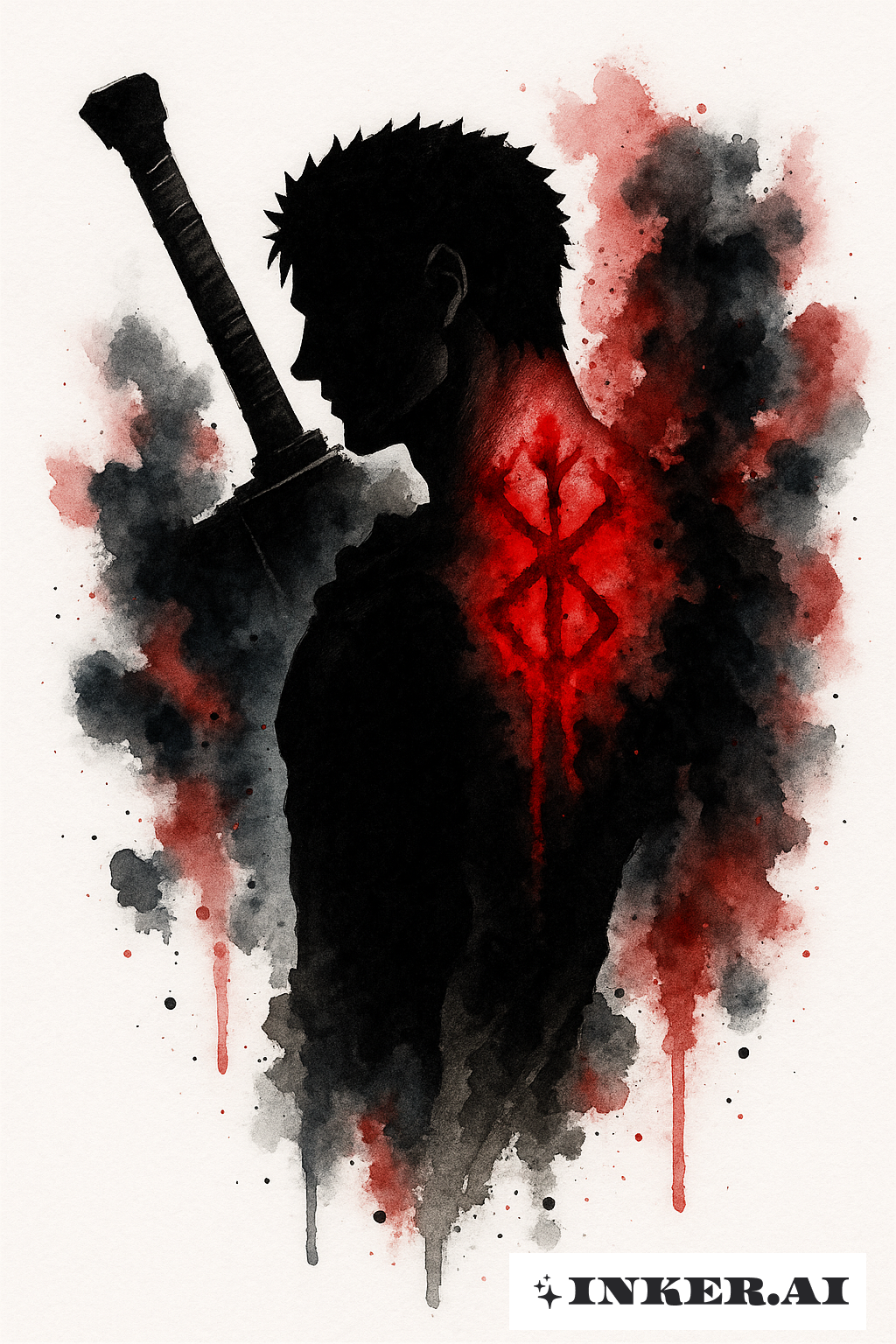
Guts's Silhouette With A Glowing Brand Of Sacrifice

Guts's Silhouette With A Glowing Brand Of Sacrifice

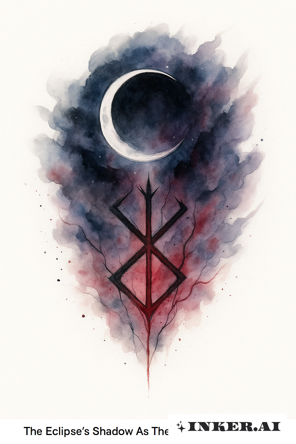
The Eclipse's Shadow As The Brand Of Sacrifice

The Eclipse's Shadow As The Brand Of Sacrifice

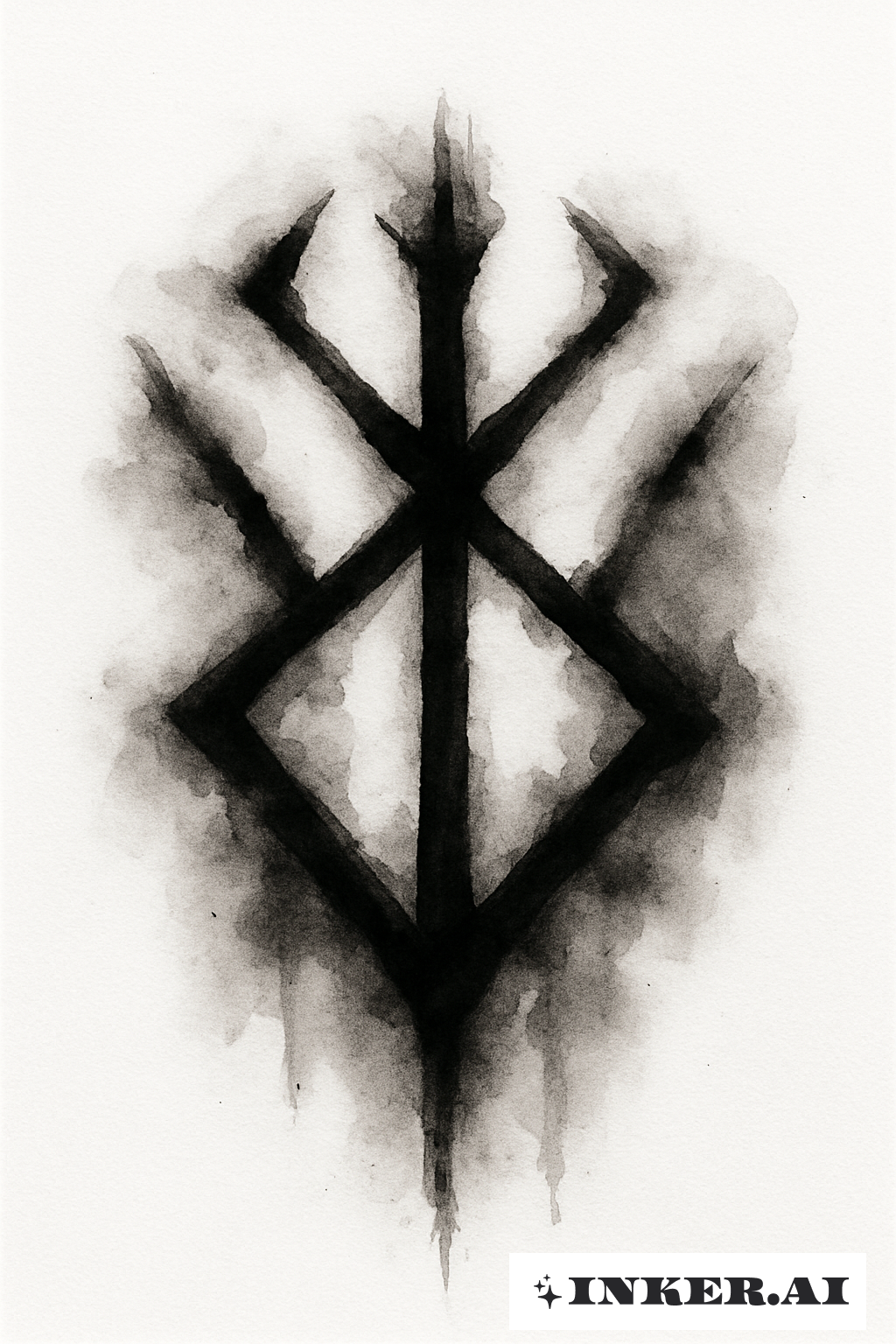
A Black Ink Wash Brand Of Sacrifice

A Black Ink Wash Brand Of Sacrifice

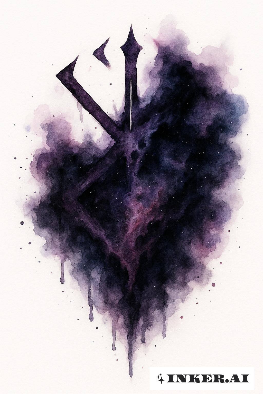
The Brand Of Sacrifice Dissolving Into A Dark Nebula

The Brand Of Sacrifice Dissolving Into A Dark Nebula

A Blood-Red Splash Forming The Brand Of Sacrifice

A Blood-Red Splash Forming The Brand Of Sacrifice

The Brand Of Sacrifice Inside A Broken Circle

The Brand Of Sacrifice Inside A Broken Circle

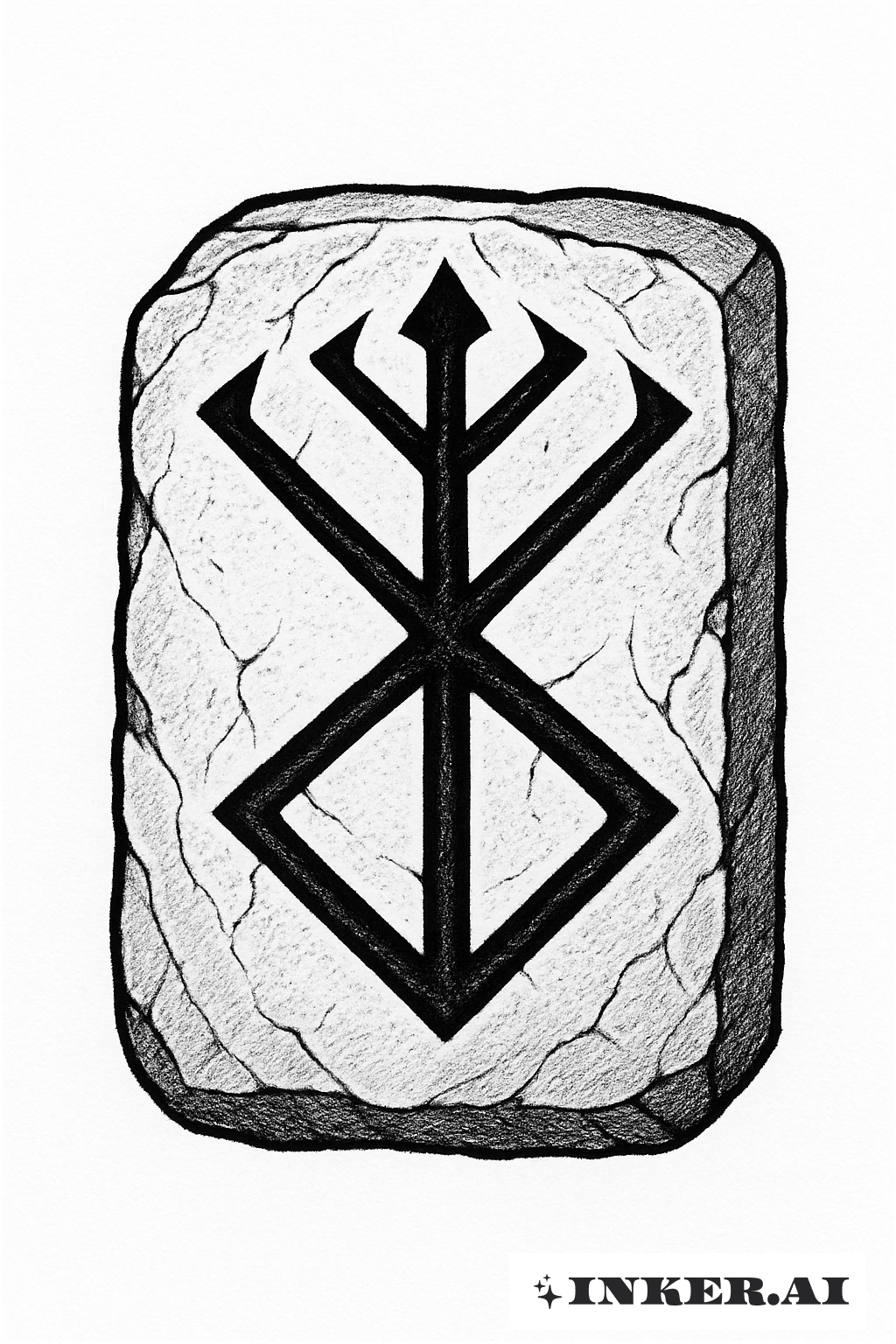
The Brand Of Sacrifice Etched Into Stone

The Brand Of Sacrifice Etched Into Stone

A Chained Brand Of Sacrifice

A Chained Brand Of Sacrifice

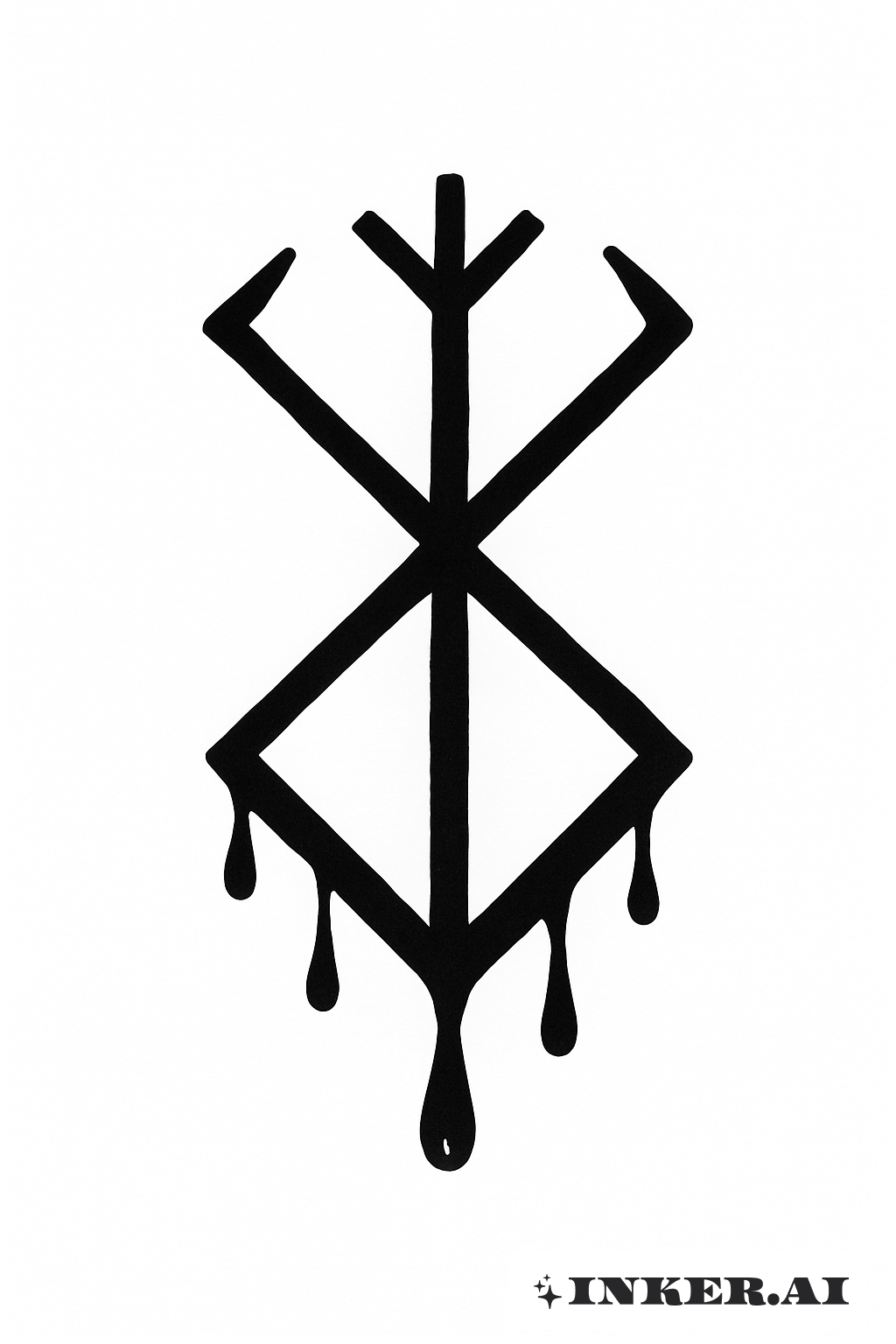
The Classic Bleeding Brand Of Sacrifice

The Classic Bleeding Brand Of Sacrifice